Most websites just exist. They have a homepage, an about page, a services page, and a contact form. They load without critical errors. They look professional enough on a desktop screen. But they generate almost no business. The business owner posts on LinkedIn, drives traffic through word of mouth, and wonders why nobody is booking through the website. The answer is almost never the traffic. The answer is the conversion.
The average B2B conversion rate from SEO traffic in 2026 is 2.6%, according to First Page Sage’s 2025 industry report. For professional service businesses — coaches, consultants, agencies — the average is closer to 1% to 2%. This means that for every 100 people who find your website through search, 98 to 99 of them leave without taking any action. The website exists. It is just not converting.
A converting website is different in kind, not just in degree. It is designed — at every level, from the first headline to the footer — around one question: what does a visitor need to see, read, and feel to take the action we want them to take? Everything else is noise. This article covers the specific elements that separate a converting website from a digital brochure, with 2026 benchmarks and real examples of what the difference looks like in practice.
The Three-Second Test — Why Most Websites Fail Before the Scroll
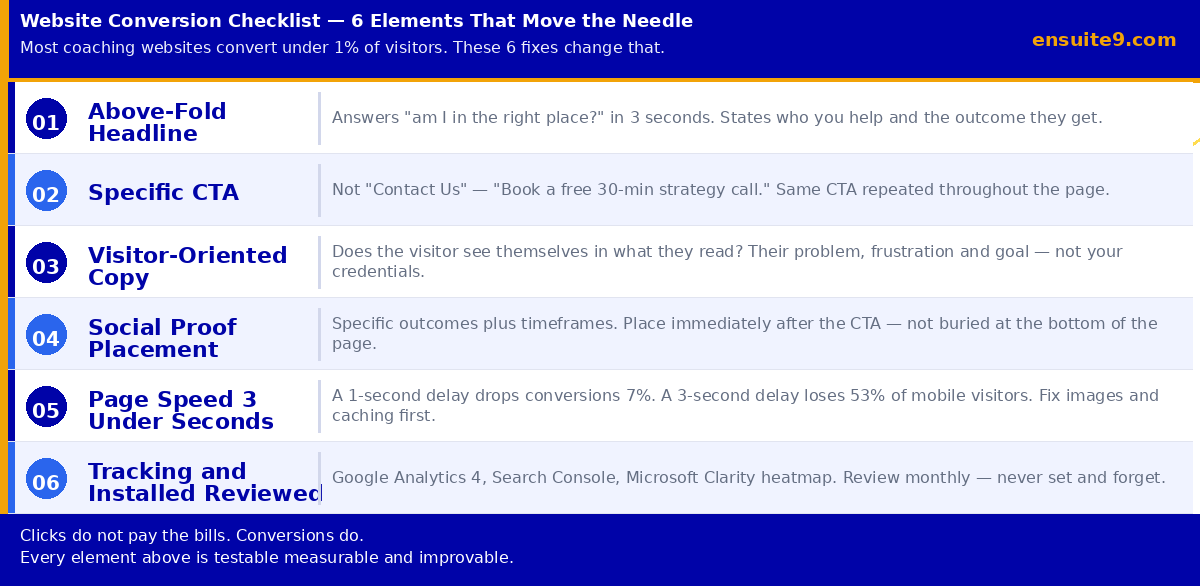
Your website has approximately three seconds to answer the visitor’s first and only question, which is: am I in the right place? If the answer is not immediately obvious from what they can see without scrolling — the above-the-fold content — they leave. Not because they are impatient. Because the internet has trained everyone to make this judgment quickly and the cost of leaving is zero.
The above-the-fold section of your homepage needs to communicate three things clearly: who you help, what problem you solve for them, and what they should do next. This is all it needs to do. Everything below the fold supports, deepens, and reinforces this communication — but if the above-the-fold section does not land, most visitors never see what comes below it.
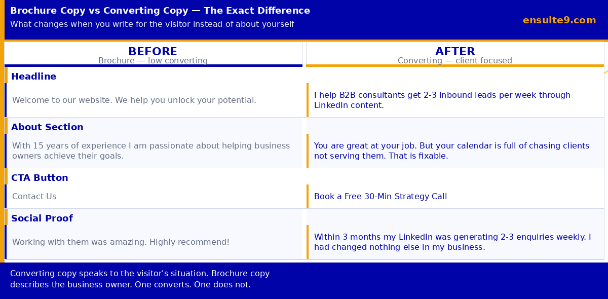
Most coaching and consulting homepage headlines fail this test because they describe the business owner rather than speaking to the visitor. Compare these two headlines:
“Award-winning executive coach helping you unlock your potential.” — This could describe any of ten thousand coaches. It tells a visitor what the coach is, not what they do for the visitor specifically. A potential client reading this cannot determine in three seconds whether this is relevant to their situation.
“I help B2B consultants generate 2 to 3 inbound leads per week through LinkedIn content.” — This tells a specific person immediately whether they are in the right place. A B2B consultant who wants inbound leads knows in under a second that this is relevant. Someone who is not a B2B consultant knows immediately it is not for them — and that is fine. A converting headline attracts the right people and filters out the wrong ones. A vague headline attracts nobody specific.
The CTA Problem — Why “Contact Us” Does Not Convert
Most websites have a call to action. Most of those calls to action do not work. The problem is almost always specificity. “Contact us” is an instruction, not a call to action. It tells the visitor what to do — but it does not tell them what will happen, how long it will take, what it is about, or why it is worth their time. The friction between “contact us” and the act of contacting is entirely in the visitor’s mind because they have no information to reduce it.
A converting CTA eliminates that friction by answering those questions in the button itself: “Book a free 30-minute strategy call to discuss your LinkedIn content” tells the visitor exactly what will happen (a call), how long it will take (30 minutes), that it is free, and what it is about (their LinkedIn content). The friction between reading this and clicking it is dramatically lower than the friction between reading “contact us” and filling out a form.
The mechanics of CTA placement also matter significantly. Delaware-Harvard Business Service increased completed orders by 15.68% simply by tweaking navigation bar and CTA text. Your primary CTA should appear: in the above-the-fold section before the visitor scrolls, in the navigation bar so it is visible on every page at every scroll position, and at the end of every major section of the homepage. The same CTA, in the same words, repeated consistently. Three different CTAs sending visitors to three different places creates choice paralysis, not conversion.
For most coaches and consultants, the highest-converting primary CTA is a free discovery call. Low friction (no money changes hands), high value (the visitor gets expert time), and it moves them into your pipeline at the earliest possible point. Make booking as frictionless as possible — a direct Calendly or cal.com link removes every barrier between interest and a booked meeting.
Copy That Converts vs Copy That Informs
The single biggest difference between a converting website and a brochure website is usually the copy — specifically, whether the copy speaks to the visitor’s situation or describes the business owner. These are fundamentally different writing tasks that produce fundamentally different results.
Informational copy describes what you do: “We provide comprehensive executive coaching services for senior leaders.” Converting copy speaks to what the visitor wants and the gap between where they are and where they want to be: “You are great at your job. Your calendar is full. But you are managing up, managing down, and somehow still not making the strategic impact your role was supposed to enable. That gap is not a talent problem. It is a leverage problem.”
The test for converting copy is simple and reliable: does the visitor see themselves in what they are reading? Does it describe their situation, their frustration, their goal — in language they would use themselves? If yes, it converts. If it describes you and your credentials rather than them and their situation, it informs but does not move them.
The About page is the most consistently misused page on coaching and consulting websites. Most About pages are structured as career summaries — a chronological narrative that starts with education and ends with current work. A potential client reading this learns about you. They do not recognise themselves or their problem anywhere in the narrative, so the page does no conversion work. A converting About page starts with the client’s problem, demonstrates that you understand their situation from the inside, introduces your methodology as the response to that problem, provides specific evidence that it works, and ends with a clear CTA.
Social Proof — The Right Kind, in the Right Place
Social proof works when it is specific, credible, and placed at the moment when a visitor needs it most. Generic testimonials like “Working with them was amazing!”, prove nothing and convert nobody. Specific testimonials that describe a real outcome in real terms are a different category of asset entirely.
The difference: “Working with Azeezat was incredible. I highly recommend her” versus “Three months after working with Ensuite 9 on our LinkedIn content, I was getting two to three inbound enquiries per week from target clients. I hadn’t changed anything else in my business. The content was the variable.” The second testimonial describes a specific outcome (2-3 enquiries per week), a specific timeframe (three months), a specific channel (LinkedIn), and a specific attribution (the content was the variable). A potential client reading it can imagine their own situation improving in a comparable way. The first testimonial gives them nothing to hold onto.
To collect testimonials like the second example, ask your clients specifically: “What specifically changed after we worked together, and how long did it take?” Not “can you write a testimonial” — that produces generic praise. The specific question produces specific evidence.
Placement matters as much as quality. Most websites put testimonials at the bottom of the homepage where the majority of visitors never scroll. The highest-impact placement for a coaching or consulting website is immediately after the primary CTA, at the exact moment when a visitor is considering whether to click. That is the moment when social proof does its most important work: reducing the residual doubt that is preventing the click.
Page Speed — The Invisible Conversion Killer
Every additional second of page load time reduces conversions. A one-second delay in page load time reduces conversions by approximately 7%. A three-second delay loses 53% of mobile visitors before the page has even finished loading. These are not marginal effects — they are structural revenue losses happening every day on slow websites, invisible to the business owner because the visitors who left never appear in the data as lost opportunities.
In the Nigerian context, where the majority of visitors are accessing websites on mobile data connections rather than fixed broadband, page speed is even more critical. A website that loads in 2.1 seconds on a Lagos fibre connection may load in 5 to 6 seconds on a typical mobile data connection outside of Lagos. That 5 to 6 second load time is losing more than half your mobile visitors before they ever see your headline.
The most common causes of slow WordPress websites and their fixes:
- Uncompressed images: the most common and most impactful cause of slow load times. Every image uploaded to WordPress should be compressed before upload using a tool like ShortPixel, TinyPNG, or Smush. A hero image that is 4MB before compression and 180KB after compression produces a load time difference measurable in seconds on mobile
- No caching plugin: caching stores a static version of your pages so WordPress does not have to regenerate them from the database on every visit. LiteSpeed Cache (free) and WP Rocket (paid) are the most effective options. Installing and configuring a caching plugin is typically one of the highest single-action improvements available to a slow WordPress site
- Too many plugins: every active plugin adds load to every page request. Audit your plugins quarterly — remove anything not actively earning its place. The goal is not zero plugins but the minimum number of plugins required to deliver the functionality the site actually needs
- Cheap hosting: hosting on an underpowered server is a ceiling that no amount of optimisation can overcome. Quality hosting (SiteGround, Kinsta, or similar) costs more than bargain options but produces load times that bargain hosting cannot match regardless of how well the site is optimised
Test your page speed at pagespeed.web.dev — Google’s free tool. A score below 70 on mobile is actively costing you conversions. A score above 85 on mobile is competitive. Run the test on your homepage and your highest-traffic service or about page. The results will tell you specifically which elements are causing the most damage.
Tracking — You Cannot Improve What You Cannot Measure
A converting website is not a static asset — it is a system that should improve continuously as you gather data about how visitors actually behave on it. Without tracking, you have no data, no baseline, and no way to determine whether changes are producing improvements or making things worse.
The minimum tracking stack for any coaching or consulting website in 2026:
Google Analytics 4 — tells you where visitors come from, what pages they visit, how long they stay, and which traffic sources produce visitors who take action versus visitors who leave immediately. Install via Google Tag Manager or directly in your WordPress site using a plugin. Review monthly at minimum.
Google Search Console — tells you which search terms are bringing visitors to your site, which pages are ranking, and what technical issues Google has identified with your site. Connect your site and submit your sitemap within the first week of launch. This is free and provides data that Analytics alone cannot give you.
Microsoft Clarity — a free heatmap and session recording tool. Shows you exactly where visitors click, how far they scroll, and where they leave your pages. This data often reveals problems that analytics numbers cannot explain: a call to action that visitors scroll past without noticing, content that appears above the fold on desktop but is buried on mobile, a form with a field that consistently causes abandonment. Install the Clarity WordPress plugin and let it collect data for 30 days before your first review.
Once your tracking is in place, the monthly questions to ask: Which pages have the most traffic and the lowest time-on-page (indicating visitors are not finding what they came for)? Which traffic sources produce visitors who stay longer and take more actions? Which devices (mobile, tablet, desktop) have the highest and lowest conversion rates, and what does the experience look like on the underperforming device type?
The Conversion Audit — Where to Start If Your Website Is Already Live
If your website already exists and is not converting, the fastest path to improvement is a structured audit rather than a rebuild. A full rebuild takes months and costs significantly more than targeted improvements to the elements that are currently limiting conversion. The audit identifies the specific bottlenecks — and in most cases, addressing the top two or three bottlenecks produces 80% of the available improvement.
Run through these audit questions in order:
Above the fold: Can a visitor in your target audience determine within three seconds whether they are in the right place? Test this by showing your homepage to five people who match your ideal client profile for three seconds and then asking them what the website is for and who it is for. If most of them cannot answer accurately, the above-the-fold content is your primary bottleneck.
CTA: Is your primary call to action specific enough to reduce friction? Does it appear above the fold, in navigation, and after each major section? Is it the same CTA throughout, or are there multiple competing actions?
Copy orientation: Read your homepage copy aloud. How many sentences start with “We” or “I” versus “You”? A converting homepage speaks primarily to the visitor. A brochure homepage speaks primarily about the business.
Social proof: Are your testimonials specific (outcome + timeframe + attribution)? Are they placed above the fold or immediately after your CTA, or are they buried at the bottom?
Speed: What is your PageSpeed score on mobile? If below 70, identify the specific issues and fix the largest ones first.
Tracking: Is Analytics 4 installed and confirming data collection? Is Search Console connected and verified? Is a heatmap tool collecting session data?
For a broader view of what web design choices create these problems in the first place, see: How to Choose a Web Designer in Nigeria — 7 Questions to Ask Before You Pay.
Frequently Asked Questions
What is a good website conversion rate for a coaching or consulting business?
The average B2B conversion rate from organic search traffic is 2.6% according to First Page Sage’s 2025 report. For professional service businesses, a well-optimised website with a clear offer, specific copy, and a frictionless booking process can realistically achieve 3% to 5% conversion from organic traffic. Most unoptimised coaching and consulting websites convert at under 1%.
How much does conversion rate optimisation cost?
The most impactful CRO changes for coaching and consulting websites — rewriting headlines, improving CTAs, adding specific social proof, compressing images, installing a caching plugin, and setting up tracking — can be done at zero additional cost if you have access to your website. The investment is time and the willingness to make changes based on what the data shows rather than what feels right aesthetically.
Do I need to rebuild my website to improve conversions?
In most cases no. According to ThunderClap’s 2026 analysis, 20 to 40% conversion lifts are achievable through strategic optimisation including copy changes, CTA repositioning, social proof placement, and technical fixes — without redesigning the site. A rebuild is appropriate when the current site has fundamental structural problems (wrong platform, no mobile-first design, unresolvable speed issues) rather than optimisation problems.
What is the single highest-impact change I can make today?
Rewrite your homepage headline. Test it on five people in your target audience using the three-second rule. If they cannot accurately describe who the website is for and what it does for them within three seconds of viewing, the headline is the bottleneck. A specific, visitor-oriented headline that passes the three-second test typically produces the fastest and most significant single improvement in any audit.
Ensuite 9 builds websites for coaches, consultants, and service businesses that are designed to convert from the first page load, with mobile-first design, Core Web Vitals compliance, conversion-oriented copy structure, and tracking setup included as standard. If you want us to audit your current website and identify your highest-impact conversion bottlenecks, book a free 30-minute discovery call.