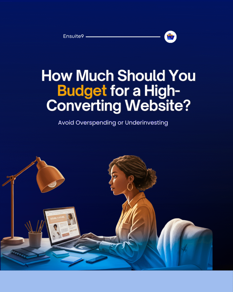
Let’s say you’ve launched your website. You’ve shared the link with your network, you’re proud of how sleek it looks, and you’re starting to see traffic trickle in.
But then…crickets.
No sign-ups. No calls. No bookings. Just numbers in your analytics — and silence in your inbox.
If this sounds familiar, you’re not alone. At Gridline, we audit dozens of sites every month that look “fine” but don’t work — and it often comes down to the same few mistakes. These aren’t just technical bugs. They’re strategic blind spots. The good news? They’re 100% fixable.
Let’s walk through the top 5 website conversion killers — and how to turn them around.
1. No Clear Call to Action (CTA)
A visitor lands on your page, scrolls a bit, and then… leaves. Not because they weren’t interested, but because you didn’t tell them what to do next. Every page on your site should guide a specific action. Whether it’s filling a form, downloading a guide, booking a call, or browsing your store — you must direct the next step.
How to fix it?
- Have one clear CTA per page-Use buttons with action-oriented language (e.g., “Start My Free Trial,” “Get a Quote,” “Book a Call”)
- Place CTAs above the fold and again after key sections
- Use consistent design (color, font, placement) so your CTA is easy to find and hard to miss
Pro Tip: Avoid “Submit” or “Learn More.” Be specific and benefit-driven.
(See: From Strategy to Launch: The Process)
2. Trying to Talk to Everyone
Your copy is full of generalities: “We help businesses grow,” “We deliver value,” “We offer innovative solutions.”
People don’t resonate with vague claims — they respond to specifics. If you’re trying to appeal to everyone, you’ll end up connecting with no one.
How to fix it?
- Get clear on your ideal customer: who they are, what they struggle with, and what they hope to achieve
- Speak directly to one person’s need or pain point
- Use language they would use themselves — not corporate jargon
- Address their situation, not just your product
Example:
Instead of: “We help brands grow through web design”
Try: “We build conversion-optimized websites for service providers ready to attract clients and scale.”
(See: The Complete Guide to Hiring a Web Designer Who Converts)
3. No Proof or Trust Signals
You make bold promises, but you don’t back them up. No testimonials, no case studies, no client logos, no track record.
In a digital world full of noise, trust is currency. Social proof shortens the time it takes a visitor to believe you’re legit.
What you can do instead?
- Add testimonials on key pages (homepage, services, landing pages)
- Showcase logos or industries you’ve worked with
- Share screenshots of real results (emails, analytics, wins)
- Highlight press features or endorsements
- Include “about us” content with real team bios and photos
(See: Mistakes That Hurt Your Results)
(See also: The Complete Guide to Hiring a Web Designer Who Converts)
4. Slow Load Time and Poor Mobile UX
Your site takes more than 4 seconds to load. It looks messy on phones. Buttons are hard to tap. Visitors get frustrated and bounce. 40–60% of web traffic comes from mobile. Google also ranks you lower for poor site speed and usability. A slow, clunky experience = lost conversions.
How to fix it?
- Compress and optimize images (without losing quality)
- Remove unnecessary plugins or code
- Use caching tools and CDNs (like Cloudflare)
- Choose a lightweight theme and test mobile responsiveness
- Test performance with tools like GTmetrix or Google PageSpeed Insights
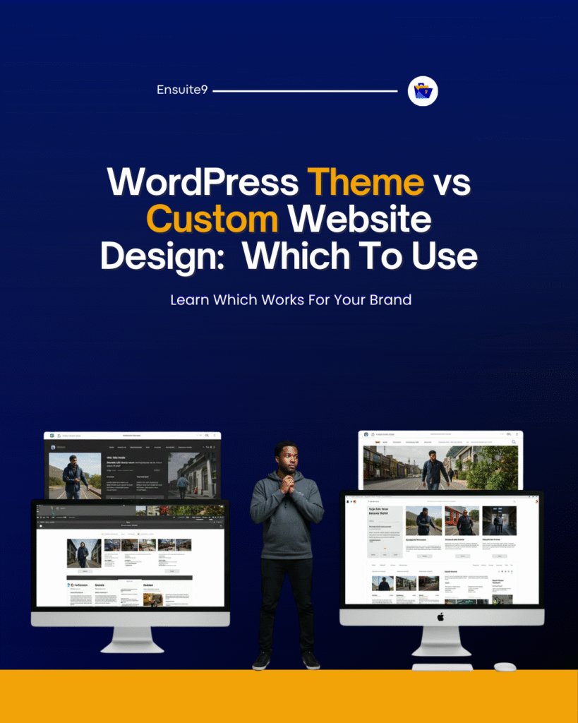
(See: WordPress Theme vs. Custom Design)
5. Weak Messaging and Overloaded Pages
Your pages are jam-packed with information, multiple CTAs, or feature lists that don’t mean much to your audience. People scan, not read. If it takes effort to understand what you do, they’ll click out before they figure it out.
How to fix it?
- Use simple, benefit-focused language
- Keep each page focused on one goal
- Break down content with headings, bullets, and visuals
- Translate features into real-life outcomes
Example:
“Fast delivery” → “Get your product by tomorrow — no last-minute stress.”
“Responsive design” → “Looks amazing on any device, so you never lose a visitor.”
(See: Design vs Development – Know the Difference)
(See also: From Strategy to Launch: The Process)
Bonus Mistake: No Analytics, No Feedback Loops
If you’re not tracking what users do, you’re guessing. Not improving.
Install Google Analytics, Google Search Console, and tools like Hotjar or Microsoft Clarity to:
- See where users drop off
- Track your best-performing pages
- Identify friction points
- Make data-informed decisions
(See: Common Challenges in Hiring Designers)
Remember, Design Doesn’t Convert — Strategy Does
It’s not enough to have a “nice” website. A converting website tells a clear story, builds instant trust, guides the user with intention, works fast and across devices, and solves a real problem for a real person.
At Gridline, every design decision is rooted in these principles. We don’t just build websites — we build conversion systems.
If you want a free mini-audit of your homepage, comment “AUDIT” and we’ll give you personalised pointers. Feel free to also explore our offers: See Website Services Overview